If your company has a brand manual, why doesn't it have a customer journey?

Many companies have communication guidelines. Fewer, however, have a UX resource library. But, just like the brand manual, it is an essential reference for any project that has an impact on the customer.
Consistency First (or Not?)
A company should always talk to the customer consistently: it should ensure that every external communication instance is unambiguous, functional to business objectives, and meets expectations. This is why brand manuals exist, prescribing the correct use of graphic elements, tone of voice and choice of words when we communicate with the customer.

If this seems obvious, I invite you to consider some cases I have observed:
- A company is working on two apps simultaneously, with largely overlapping purposes; the projects were commissioned by two different entities, without one being aware of the other's work.
- A new website replicates part of the functionality of an existing project of the same company and targets the same audience. Only the manager who commissioned it is different. The result is that the customer will face two different sites telling them more or less the same things.
- Two company projects directly compete: two applications for managing products purchased by the customer both require installation and registration, without it being clear which is the "right" one.
What was missing in these cases? A shared corporate perspective on the occasions when the user comes into contact with the company.
It's as if the company presents itself to the user as a many-headed monster, each head loudly calling to attract attention.

Companies cannot afford these wastes. We're not talking just about communication in a marketing sense: we're talking about any contact opportunity between the company and the customer/user, from evaluation to conversion, from registering purchased products to buying additional services or spare parts, from usage tips to support. All these aspects contribute to forming a customer's User Experience, whether we are in a B2C or B2B context.
Let's go back to our comparison with brand guidelines: if the brand manual allows us to talk to the customer with a consistent voice, we need the same consistency from a User Experience perspective. Otherwise, we'll give an impression of inconsistency and lose credibility (just as when we don't follow brand guidelines).
How can we avoid this impasse? Thanks to the definition and sharing of corporate UX resources, which provide coordinates for all customer-facing projects.
Mapping UX: Coordinates
Let's focus on two particular UX resources: personas and journey maps.
Persona
Personas are synthetic representations of our customer and their salient characteristics: background, habits, goals, and challenges.
We should cover everything strictly related to our product or service: for example, we're not interested in broad life aspirations or demographic information if they're not connected to what we expect the user will do with our product (this is one of the differences between UX personas and marketing personas, which have partly different purposes).

Why are personas useful? Because it's not enough to say "this project targets potential leads, our customers, our audience": inside companies, each department has its own view of the customer, inevitably partial for structural reasons. In medium-large companies, knowledge is often strongly compartmentalized, and organizational complexity does not favor the exchange of information between departments.
There are departments with more empirical knowledge of the customer (e.g., Customer Care), others relying on representations based on data and studies (e.g., Marketing), others still that rarely have access to the customer in any form (e.g., Information Technology). However, each of them could be the internal client and main stakeholder of a project impacting the final customer.
A shared persona has the ability to collate and summarize all the knowledge about the customer and allow each department to evaluate the opportunity of undertaking a project. Provided one fundamental condition: the persona must be based on user research, not on prejudices or personal beliefs.
AND EMILI specializes in development and strategic consultancy for digital channels.
Journey maps
Journey maps are timelines that tell the stories of the relationship between a customer (in the form of a persona) and a company's service or product.
Depending on the purpose and level of detail, they can be classified as Experience Maps, Customer Journeys, or Service Blueprints.

In general, a typical journey map includes:
- A scenario, i.e., the context and motivations in which the customer/persona interacts with the company's offer (e.g., the need to subscribe to a new supply contract);
- a series of subsequent phases, the last of which will represent the story's goal (e.g., purchasing the product or service);
- touchpoints: all points where the customer directly interacts with the companies, both physical and digital (e.g., sales points, website, call center, social networks...);
- pain points and opportunities: closely related, also called “moments of truth”; critical points where the customer can advance in meeting their goals or get stuck and become frustrated; these are the points where the company can make a difference by improving the customer's UX.
Exactly like personas, it's necessary that the maps are based on user research, and not on beliefs.
What can a journey map help with? If shared, and if based on real data and observations, it allows us to understand the opportunity of undertaking a project in terms of the overall relationship between the company and the customer: understand if there are already touchpoints overseeing a phase of the journey, or if we find ourselves in a “blind corner” where the customer is left to fend for themselves. If it's an already overseen point, we can question whether the current solution is working as expected and if synergies or reinforcements are appropriate.
A project, therefore, is not just undertaken because it's an initiative of this department or that manager: it's carried forward because it harmonizes with business objectives and the relationship between the company and the customer as a whole.
To summarize, every time we think of starting a project, we can use corporate UX resources to avoid waste, overlap, and conflicts, maximizing the accuracy and effect of our efforts. We do this by adopting the correct persona, i.e., the typical customer we are addressing, and identifying through the journey map the occasion in which the persona will interact with the new touchpoint we are designing.
A proposal: Journey Maps Ops
How to adopt a common perspective in the company? It involves sharing a customer-centric vision on which to map current projects and evaluate future ones. This vision must transcend barriers between departments, overcoming competence silos to spread a high-level vision of the relationship between the customer and the company's offer.
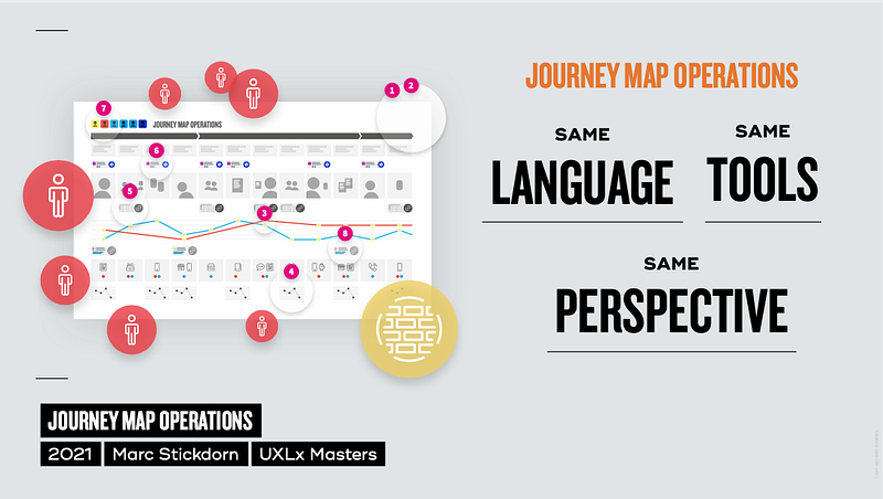
For this purpose, Marc Stickdorn proposed the solution of Journey Maps Operations: a process through which activities impacting the customer are mapped and designed thanks to the combination of different levels of strategic and operational detail.
In fact, Journey Maps Ops allows for "zooming" in on processes from a higher level, representing the customer's relationship with the company over a broader arc, to more detailed levels, where more specific experiences that are part of that broader one are mapped and narrated.

© Marc Stickdorn
Example: Airline customer
An airline might use a high-level journey map, representing the story of the customer from the travel preparation phase to arrival at the destination: this path will include all the "macro" phases, from planning the trip to comparing fares, from packing to arriving at the destination.
The company will then use more detailed journey maps to better describe individual parts of the story: for example, the airport will have its own map showing the different steps (travel to the airport, passport control, check-in...) with the respective touchpoints (self-service touch screens, information desk...).
Journey maps are meant for both mapping the current state and designing future touchpoints: for example, the creation of a smartphone app that guides the customer through the boarding process will be evaluated in relation to the journey phase and existing touchpoints (e.g., some airports might provide their own app for the same purpose).
The high-level vision is the common reference for the whole company, while detailed maps are those on which stakeholders of specific projects evaluate opportunities, always in a customer-centric and UX-centric vision shared by the entire organization.
Where to start?
Can Journey Map Ops be the right answer for all organizations? Let's say it's a possible answer, and its applicability depends on the organization and, above all, efficient communication flows (Stickdorn, for instance, talks about "Journey Maps Coordinators" who take care of interdepartmental alignment).
What we can keep in mind is that building resources to map the User Experience at the corporate level is a continuous, collaborative process that does not end in a circumscribed research phase but needs to be kept up to date to be truly useful to the company's objectives. Personas and Journey Maps are living documents, to be maintained with research and disseminated with good communication. Working on a specific project will lead us to learn something more about the user, consequently updating the UX resources in the corporate repository; all departments will benefit from it when they evaluate future projects.
AND EMILI specializes in development and strategic consultancy for digital channels.
This page has been translated using automated translation tools and artificial intelligence technologies. We strive to ensure that the content is accessible in multiple languages, but please be aware that the translation may not be perfect. If you have any doubts or need clarifications, please feel free to contact us.


