Web accessibility: why does it matter?

Anyone involved with the web will, sooner or later, encounter the topic of accessibility, a subject often underestimated or not fully understood. Let's explore together what we mean when we talk about website accessibility and why it's important to consider it in our work as "web architects."
The project is important
Imagine a company owner wants to create a new exhibition space, aiming for potential customers to visit it to gather information about their business, the types of products sold, and possibly make purchases.
This visionary entrepreneur turns to an architect, commissioning the creation of the project. The architect, equipped with the tools of the trade, designs a futuristic building with advanced and fascinating design ideas, and then presents everything to the client. The business owner appreciates the proposal and even offers lavish compliments, but notices a small detail. The architect has designed a building without a door.
 Photo by Karolina Grabowska from Pixabay
The entrepreneur points out that in this way, customers won't be able to enter the building, visit rooms that illustrate the company's history and display products ready for sale, or are used for information requests. The architect argues that people can easily access the interior through the windows, supporting his claim with examples of how this can be accomplished. The entrepreneur, perhaps more knowledgeable about how the world works, replies that, while it's possible, the number of people capable of entering a building through a window is small compared to all those who might be interested in visiting it.
After several hours of discussion, the architect is convinced to add a door to his project, but due to an aesthetic choice, he designs it fifty centimeters high and triangular.
The entrepreneur, almost out of patience, points out that now it's certainly easier to enter, but one must stoop — a task that could be difficult for some — and a triangular door might not be recognized as such by other potential customers, who, not understanding that this is the entrance, might give up visiting, risking turning to the competition instead.
 Photo by Michal Jarmoluk from Pixabay
The architect refuses to modify his beautiful door, so the entrepreneur decides to fire him and turn to another architect who presents a project for an equally beautiful building with a door that meets all the requirements a door should have. Additionally, since the entrance also requires the use of stairs, an alternative access method for people with mobility issues is provided. Sure, there might still be some who find it difficult to enter, but both the entrepreneur and the architect agree that this is the best possible solution to ensure the highest number of people can visit the building, engage with the products, and learn about the company's activity.
The building is thus accessible to the widest range of people possible. This is the essence of web accessibility, which we can define as follows:
Accessibility is the practice of making websites usable by the widest range of people possible, including those with disabilities.
Nothing traumatic, right? Perhaps now the concept of accessibility is a bit clearer, and we feel more at ease. Let's take a further step.
AND EMILI specializes in development and strategic consulting for digital channels.
Accessibility benefits all users
Contrary to initial assumptions, accessibility should not be perceived as a series of measures targeted solely at people with disabilities, but as beneficial to all users interacting with our website.
Revisiting our example, the first architect designed a building that could only be accessed through the windows. Perhaps he did so in good faith, convinced that climbing and using a window was sufficient for entry, and likely, he himself had no trouble doing so. Of course, this example is intentionally exaggerated, but I believe it serves well to illustrate a fundamental concept:
Stop thinking about how you navigate a website, and start considering how others do it.
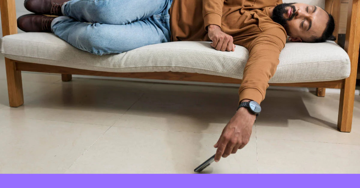
 Photo by StartupStockPhotos from Pixabay
You might be adept at interacting with a website that has a complicated and unclear navigation menu (entering the building through the window, or the low, triangular door) but there will be many users who are not able to do so and will therefore abandon your website (not entering the building and turning to the competition instead). Conversely, a website with a clear, organized, simple, and logical navigation menu (a door that has the characteristics of a real door) allows the largest possible number of users to navigate it properly, including those with disabilities.
It's evident that a 100% accessible website is an unattainable ideal since there will always be some situation where certain types of users will find difficulties interacting with it. However, as in the case of the second architect who designed the building for our entrepreneur, it's our duty as "web architects" to do our best to prevent these situations from occurring.
Users with disabilities
Having clarified this important aspect, it's clear that to properly design an accessible website, it's necessary to understand the challenges faced by people with disabilities when interacting with it.
At first glance, one might think these challenges only pertain to users with visual impairments (e.g., blindness or low vision). However, we must also consider individuals with auditory, motor, and cognitive disabilities.
Each of these types of disabilities presents different challenges that affect how users affected by them interact with our website.
 Stephen Hawking at a lecture for NASA's 50th anniversary (2008) By NASA/Paul Alers — https://images.nasa.gov/details-200804210009HQ.html, Public Domain, https://commons.wikimedia.org/w/index.php?curid=16350789
Discussing in detail the different types of disabilities and the techniques that can help solve the web access difficulties they entail goes beyond the scope of this article. The key takeaway at this point in our discussion is that we must be aware that these situations exist, they should not be ignored, and we have the necessary tools to address them. We just need to be willing.
Just as in real life, we should strive to adhere to the ideal of removing architectural barriers and not accept the design of a building that excludes certain groups of people from accessing it, we also have a moral obligation to ensure that the websites we design and develop follow inclusive practices to remove digital architectural barriers that prevent people with disabilities from interacting with or accessing the site.
Practical examples
Let's explore some straightforward examples to better elucidate these concepts.
Color and contrast
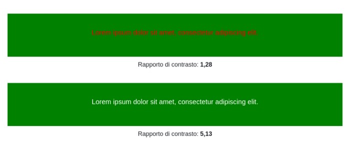
When selecting a color scheme for a website, it's crucial to ensure that the text color contrasts well with the background color. A low color contrast might produce an aesthetically pleasing effect (akin to the triangular door in our building example) but can make content difficult to read for individuals with visual impairments.
According to web accessibility guidelines, we must ensure a contrast ratio of at least 4.5:1 between the text color and the background color.
The following image illustrates two examples of contrast between the background color and the text color:
 Two examples of contrast between background and text
- The first example, with red text on a green background, presents too low a contrast and does not meet the guidelines.
- The second example, with white text on a green background, has a contrast that complies with the guidelines.
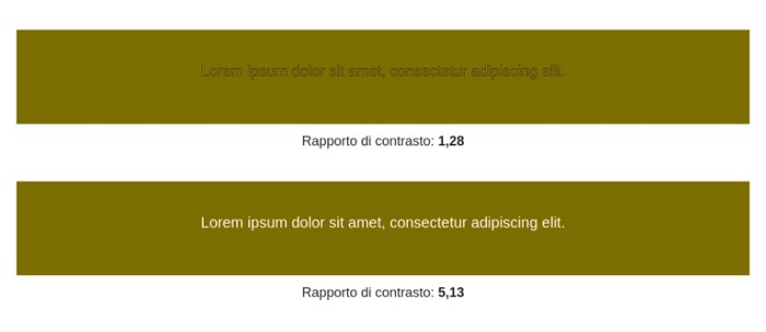
Let's go further and examine an image showing how a person with protanopia perceives the colors from the previous example:
 Two examples of contrast between background and text perceived by a person with protanopia
This simple example highlights the importance of choosing a text color that contrasts well with the background color.
Multimedia content
When our website provides important information through video or audio content, we should consider alternative access methods for these contents, such as subtitles or transcripts.
This approach benefits not only users with hearing impairments but also those who may not fully understand the language, as a transcript or subtitles can facilitate comprehension.
Moreover, to ensure the accessibility of images, we should ensure that visual content is accompanied by detailed alternative text describing the image, allowing screen readers to interpret the content.
By now, I hope to have sparked some thought on why web accessibility is vital and an aspect of our work we cannot overlook.
AND EMILI specializes in development and strategic consulting for digital channels.
This page has been translated using automated translation tools and artificial intelligence technologies. We strive to ensure that the content is accessible in multiple languages, but please be aware that the translation may not be perfect. If you have any doubts or need clarifications, please feel free to contact us.


