How it all began
It was a Monday when, amidst the flood of emails downloading onto my Mac, an unusual subject caught my eye: "Introduction to Rebranding workshops."
It was a call to arms. I could almost see Uncle Sam's gaze as I sensed we were about to enter a phase of renewal and transformation that encompassed Core Activities, the design approach, and the brand itself.
In the following months, various workshops ensued, engaging every team member full-time. Everyone was essential, everyone could and MUST speak up; we were rewriting the identity of a multicellular organism we were part of, aiming — metaphorically — to create a single nucleus.
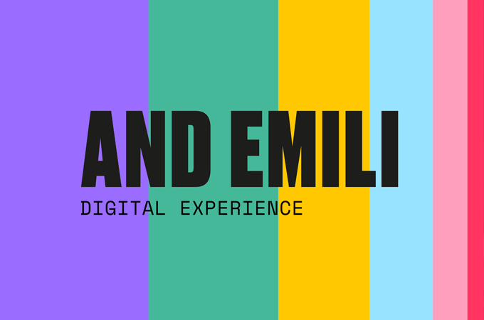
This journey allowed us to rewrite the company's identity and give it a name: AND EMILI. Thanks to teamwork, we now have a new and shared DNA, a new essence. We are, in every respect, a company that is #newinDNA.
The rebranding process led us to change not just the name and logo but also the corporate identity, positioning, and the entire corporate communication; our primary goal was to rebuild the company's image by redesigning the reputation conveyed externally through signs and values.
It's been five months since the launch and over a year since the renewal of our identity began. Here, I want to tell you about our mark through an analysis with solid theoretical and methodological foundations but a personal interpretation of the hidden messages (yet with a specific meaning) present in AND EMILI's DNA.
Classification
Around the brand swirl stylistic and figurative representations that function to evoke the company's character, translating its specifics and characteristics into visual form. The output of these elements' transposition, in our case, is attributable to the category of typograms; indeed, the writing characters used in our brand's representation belong to an existing family of characters (Druk and Space Mono).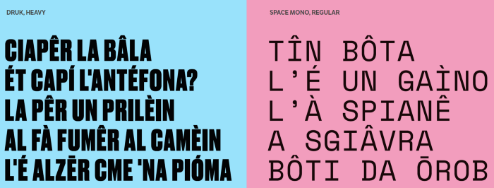
Expressive forms and rhetorical figures
Another type of categorization can be made based on the semantic characteristics of the elements composing the brand. Indeed, the visual language, even more than the verbal, uses rhetorical figures.
In the case of AND EMILI, we are faced with a metonymy on two levels:
AND: An invariable part of speech that establishes a link between elements. As its name suggests, AND EMILI is the result of collaboration, co-design, and the work of many. It is a collective signature and a unique entity that expresses itself in the third person singular and speaks on behalf of everyone.
EMILI: The use of a typical geographical location as a name constitutes a strong call to tradition and identity of a land and has a significant impact on the user's mind, associating the brand with the excellence expressed by the territory. AND EMILI is proud of its origins and declares it right from the start.
Phonetic aspects
Beyond the evocative elements tied to the very essence of the chosen name, there’s another crucial aspect to consider. Words are effective not just when they resonate with the reader's representational system; words are not merely rational or sensory. Even when devoid of meaning, they have a shape, a sound, an emotional charge: there exist "maluma" words and "takete" words, that is, words that convey sensations and subconsciously influence the reader's appreciation. Words perceived as soft and caressing, or conversely, as harsh and angular. Hard words filled with "t," "r," "z," and "s." Soft words filled with "m," "n," "p," "b." This definition comes from Alessandro Lucchini, as read in "The Magic of Writing." It’s a line of study initiated by W. Kohler's experiment (Gestalt Psychology, Liveright, New York, 1929): he presented a study group with two nonsensical words, maluma and takete, and the drawings of two abstract shapes, one rounded and the other angular; he found that 97% of people associated the angular figure with the word takete and the rounded one with maluma. The explanation lies in the brain's lateralization, discovered by R. W. Sperry, Nobel Prize winner for Medicine in 1981: it’s the right hemisphere of the brain that leads to associating the labials “m” and the liquid “l” of maluma with soft contours, and the dentals “t” and the guttural “k” of takete with rigid ones. The two hemispheres perform different functions: the left governs logic, reason; the right is the repository of intuition, and it operates by analogy.
AND EMILI is soft, welcoming, linear; its being conveys a strong emotional charge, ready and always open to creating positive connections with people and Brands.
Words indeed create very realities, and with AND EMILI, the perceptual impact is profound. In AND, we encounter a climax with a gradual transition from soft, warm (N) to strong, timely, competent (D). EMILI brings us back to reliability, trust, and understanding (M,L).

The coexistence of these perceptual aspects makes AND EMILI a perfect expression of the corporate DNA.
AND EMILI specializes in development and strategic consulting for digital channels.

Plastic analysis
A brief theoretical and methodological premise: the term semiotics refers to a discipline that studies how languages function, that is, those systems that establish relationships between a set of expressions and their contents. Generally, the term language is used in reference to spoken language, that is, verbal language. However, there are several languages—gestural language, musical language, visual language, etc.—each with a set of rules that allow for communication and the creation of meaning.
Visual semiotics provides the necessary tools for the analysis of visual language and is usually divided into two major branches:
- Figurative semiotics, which conceives images as representations of the world. (For example, a graphic image)
- Plastic semiotics, which instead studies visual configurations (lines, colors, etc.) independently of what they represent.
a. Eidetic categories
These categories relate to the forms that define, in our case, the brand, discriminating and isolating the different areas present on the visual surface. According to the social conventions present in the West, certain perceptual values are attributed to the different lines and graphic forms present in visual text; in practice, it's how humans unconsciously react to these values:
- Straight lines denote professionalism, authority, experience.
- Ascending oblique lines denote dynamism.
b. Chromatic categories
As already mentioned, the brand is the graphic symbol of a company that can be a stylization of real elements, a symbolism, or a more or less abstract representation. For the user, this symbol plays a very particular role, representing a perception.
The user rarely possesses detailed knowledge of the various technical and functional characteristics of the company. Very often, our interlocutor develops only an impression, a perception, of what actually lies behind the brand. Therefore, it is necessary to also delve into the theme of color that gives visibility and appearance to the brand and sends messages that reach the psyche of the target and trigger perception processes.
Color marketing provides different indications on how color influences purchasing choices, and by analyzing the visual identity of AND EMILI, we can isolate some important aspects related to the corporate DNA.
The primary color of AND EMILI is purple, supported by five other secondary colors, used to characterize some brand applications.
Purple symbolizes creativity and is used to convey calm and reliability. Green is the color associated with relaxation and health, transmitting care, professionalism, and human contact. Yellow is associated with optimism, while blue creates a sensation of trust and security. Pink is a color that reflects femininity, thus security, stewardship, and listening. Red evokes energy and speed.
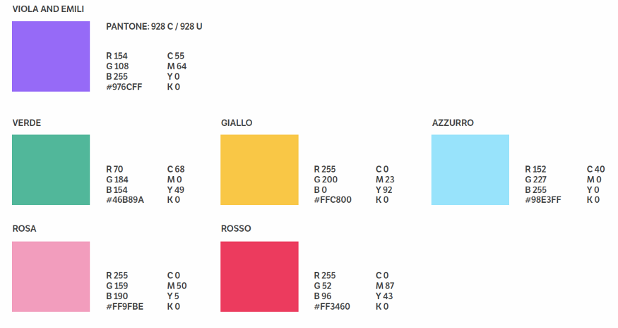 The entire palette's use allows us to reach our interlocutor on different levels of perception, acting on a sensory level to depict our DNA.
c. Topological categories
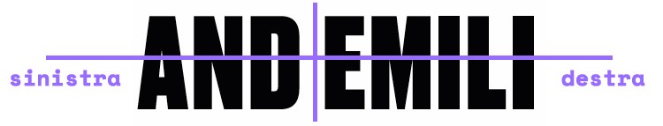
These categories investigate spatial organization. For example, when we look at a painting, we are faced with two types of space: the space that is represented (the space that appears in the painting) and the representing space (the plane on which the colors have been laid out). We can talk about rectilinear and curvilinear topological categories: the former are evaluated in reference to an axis (up/down, right/left), while the latter are built around a central nucleus that serves as a reference (central/peripheral).
In the AND EMILI brand, the topological categories are rectilinear, so the reference through which positions are evaluated is an axis (right/left), an axis that places what is inserted before AND EMILI on the same plane as the brand itself.
The concept of inclusion, listening, and equality is highlighted by the absence of topological categories like up/down; AND EMILI is the result of collaboration, co-design, and the work of many. It is both a collective signature and a unique entity.
Plastic symbolism
Simply describing the plastic categories is not enough to support an analysis. For semiotics, every expression refers to a content; therefore, we must link the forms, colors, and organizations described above to certain contents.
Within a culture, a plastic value (such as the curved character of a line or a chromatic radical) can be linked to a meaning. This is referred to plastic symbolism. Within the AND EMILI brand, we find two cases of symbolism:
The compactness and the "full" line of the letters composing the logogram are symbols of solidity, stability, awareness. No fragile lines but a stroke well anchored to the ground symbolizing experience.
The black represents versatility. Formal and elegant when used singly but at the same time, if associated with other elements (colored palette) suitable for any use and stable support for a more friendly but never too informal communication.
The claim: Digital Experience
Until a few years ago, an oxymoron. We could not talk about a true digital experience, the web was a mere tool to achieve a goal. Today, however, the use of the web can become a memorable experience, and AND EMILI, by deploying all the tools to know the users, their needs, and their aspirations, builds bonds and fills needs. It brings to life digital journeys, experiences, projects, and services that are technologically and emotionally evolved.
The strength of AND EMILI
We experienced the rebranding as a kind of Pleasantville; what were gray SAL and gloomy Kick-offs today are explosions of color. The strength of AND EMILI is precisely this: we see color even where there is none, we have future visions, we approach everything with passion. We protect the User Experience, we profess Co-Design. The strength of AND EMILI are the people, the teamwork, a new and shared heart, and the strength of a company #newinDNA.
AND EMILI specializes in development and strategic consulting for digital channels.
This page has been translated using automated translation tools and artificial intelligence technologies. We strive to ensure that the content is accessible in multiple languages, but please be aware that the translation may not be perfect. If you have any doubts or need clarifications, please feel free to contact us.